

🎯 Logos Are Basically Silent Manipulators
Pepsi didn’t just wake up one day and say, “Let’s slap a circle on a can.” Adidas didn’t pick triangles because they look cute in geometry class. Logos aren’t just doodles. They’re psychological weapons.
Before you even read a brand’s name, your brain has already judged it based on the shape. Circles whisper: “Come join us, we’re friendly.” Triangles scream: “We’re powerful, climb with us.” Squares assure you: “Relax, we’re stable.”
And the best part? You don’t even notice it’s happening. Which is exactly why I’m dragging you into the secret life of logos today. Spoiler 👀: There’s a hidden arrow in FedEx and a secret smile in Amazon.
🧠 Why Logo Shapes Actually Matter
Think of your brain as lazy but smart. It loves shortcuts. And shapes are the ultimate shortcut. They carry centuries of symbolism that we decode without even trying.
That’s why companies spend millions tweaking their logos by a millimeter. Because when a shape changes, so does your subconscious trust.
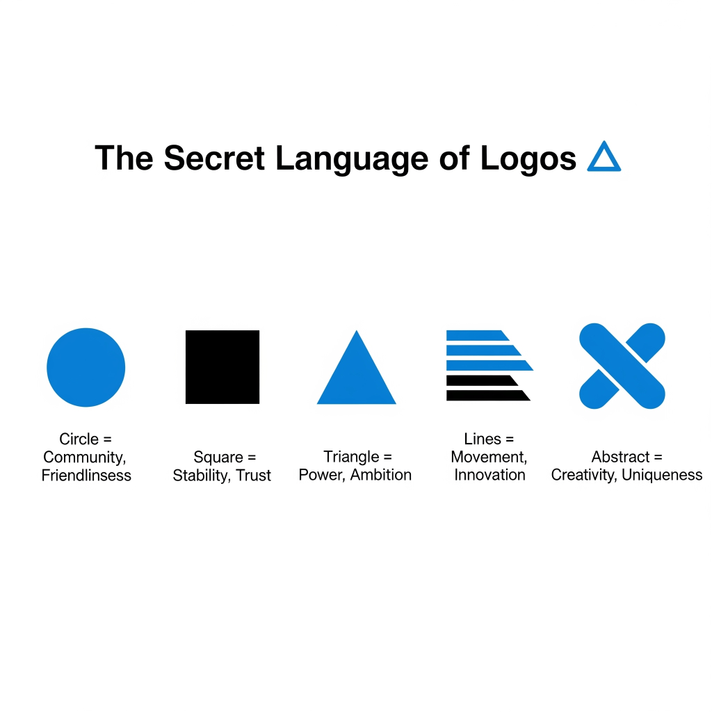
🔎 The Psychology of Logo Shapes
🟠 Circles & Ovals → Unity, Community, Friendliness
- Brands: Pepsi, Starbucks, Target.
- Subconscious message: “We’re approachable. We’re safe. No sharp edges here.”
🟦 Squares & Rectangles → Stability, Reliability, Strength
- Brands: Microsoft, BBC, American Express.
- Subconscious message: “You can rely on us. We’re structured and secure.”
🔺 Triangles → Power, Progress, Direction
- Brands: Adidas, Google Drive, Delta Airlines.
- Subconscious message: “We’re leaders. We’re ambitious. Follow us or fall behind.”
〰 Lines & Stripes → Movement, Simplicity, Innovation
- Brands: IBM, Adidas, SoundCloud.
- Subconscious message: “We’re sleek. We’re modern. We’re always moving forward.”
✨ Abstract & Custom Shapes → Mystery, Creativity, Uniqueness
- Brands: Nike swoosh, Airbnb, Twitter bird.
- Subconscious message: “We’re rebels. We’re unforgettable. You’ll never box us in.”
📝 What’s Your Logo Shape Personality?
Pick the shape that vibes with you most. Then read what it says about the kind of brand you’d be:
- 🔵 Circle → The friendly, everyone’s-invited type. You’d run a cozy café or a social app people can’t quit.
- 🟦 Square → Dependable and drama-free. You’d be a bank, a consultancy, or the reliable friend who always has tissues.
- 🔺 Triangle → Ambitious, sharp, maybe a little intimidating. You’d be a sports brand or a startup with cult vibes.
- ➖ Lines/Stripes → Minimalist and ahead of the curve. You’d run a sleek tech company or a lifestyle brand that’s pure aesthetic.
- ✨ Abstract → Quirky, unpredictable, unforgettable. You’d be an art collective or Elon Musk’s next side project.
So? Which one screamed “that’s literally me”? Drop it in the comments. I’m nosy like that.
🤯 Hidden Meanings You Never Noticed in Famous Logos
Now for the fun part. The Easter eggs hiding inside logos you’ve seen a thousand times.
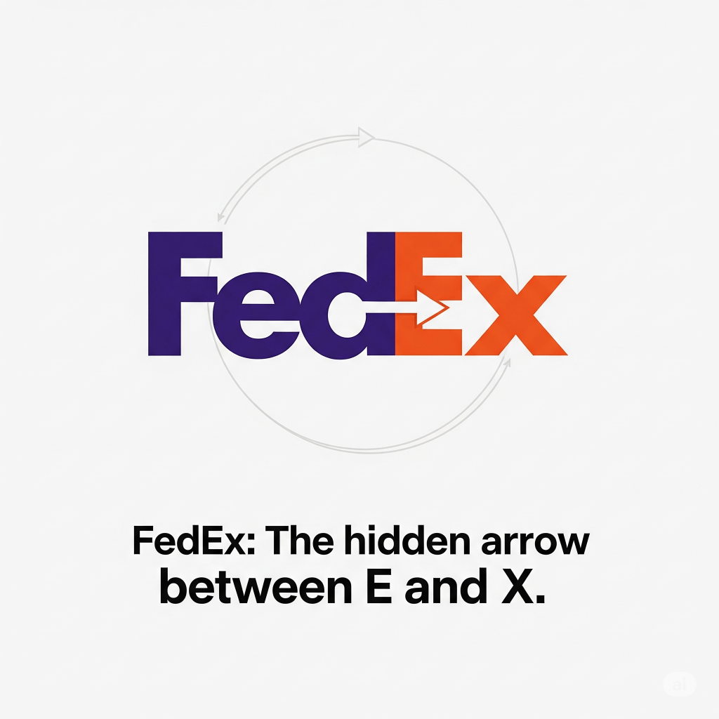
- ➡️ FedEx → Look between the E and the X. There’s a hidden arrow pointing forward.
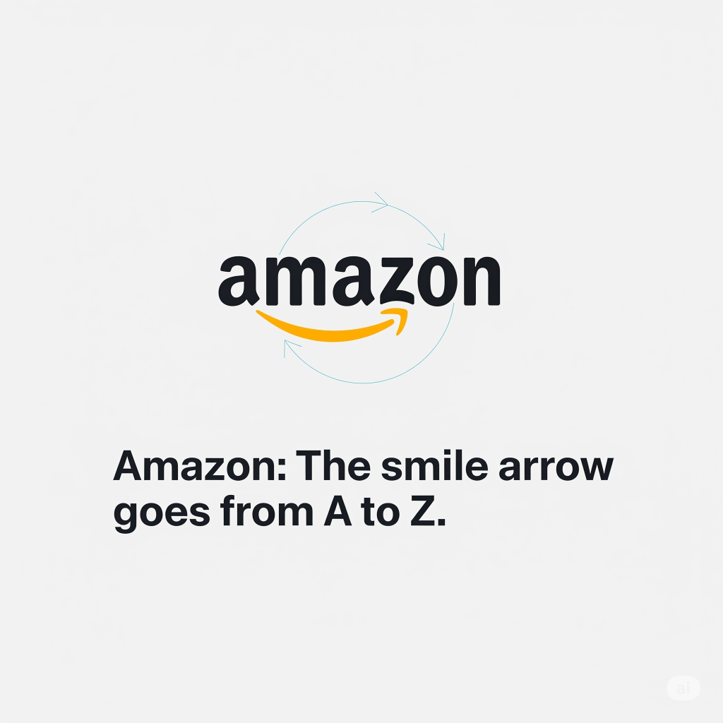
- 😊 Amazon → The smile isn’t just cute. It goes from A to Z, meaning “we have everything.”
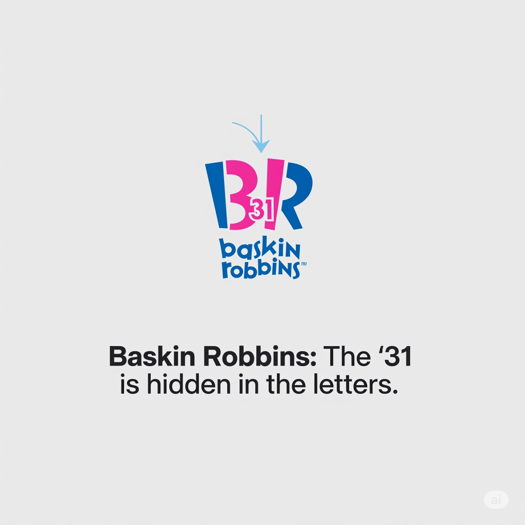
- 🍦 Baskin Robbins → The pink parts of BR reveal 31 flavors.
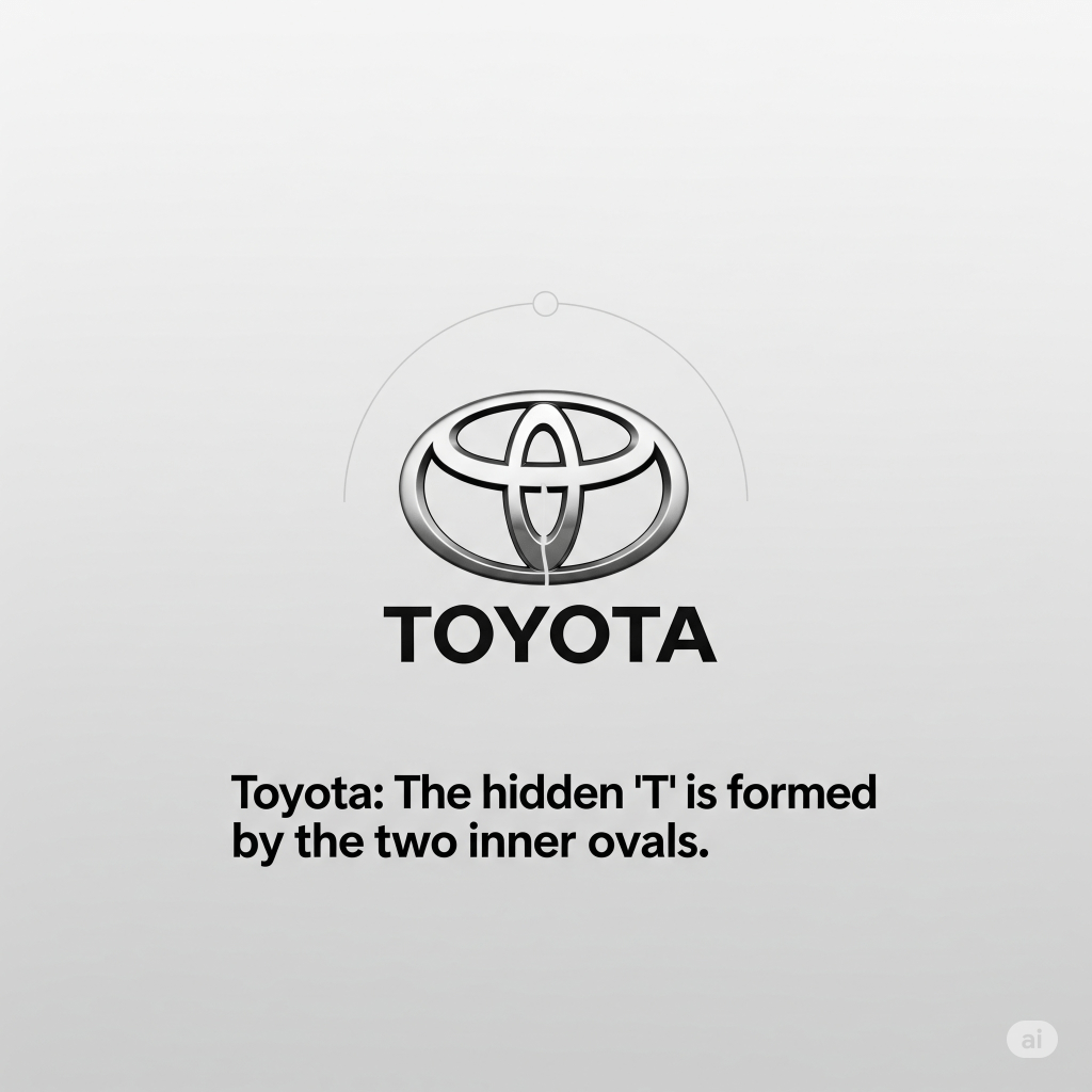
- 🚗 Toyota → Represents the interlocked hearts of the customer and company, surrounded by the world and forming a “T” for Toyota.
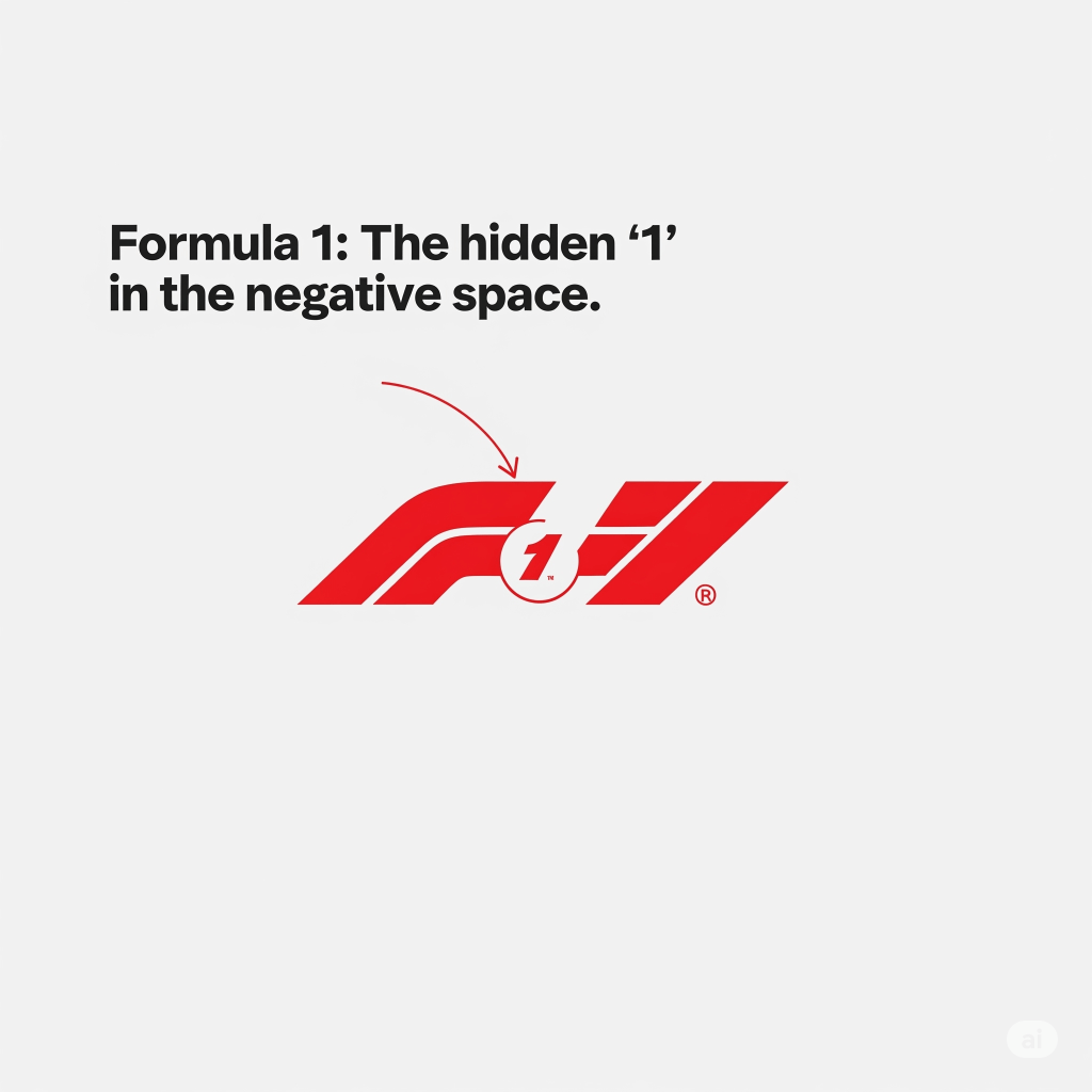
- 🏎️ Formula 1 (F1) → The black “F” and the red speed lines create a hidden “1” in the negative space.
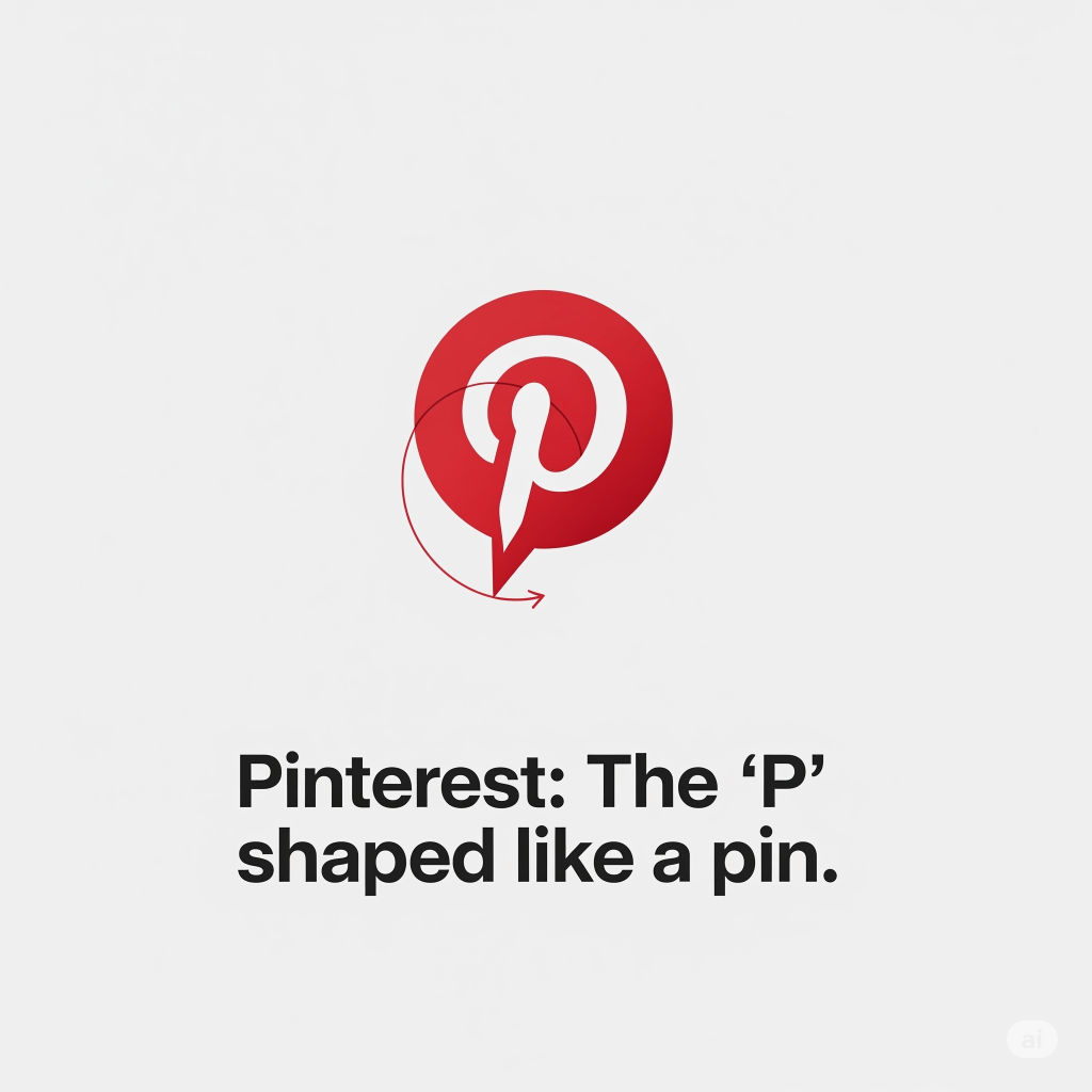
- 📷 Pinterest → The letter “P” doubles as a pin, showing the idea of saving things you love.
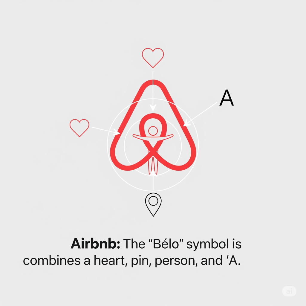
- ✈️ Airbnb → Their “Bélo” symbol combines a heart ❤️, a location pin 📍, a person 👤, and the letter “A.”
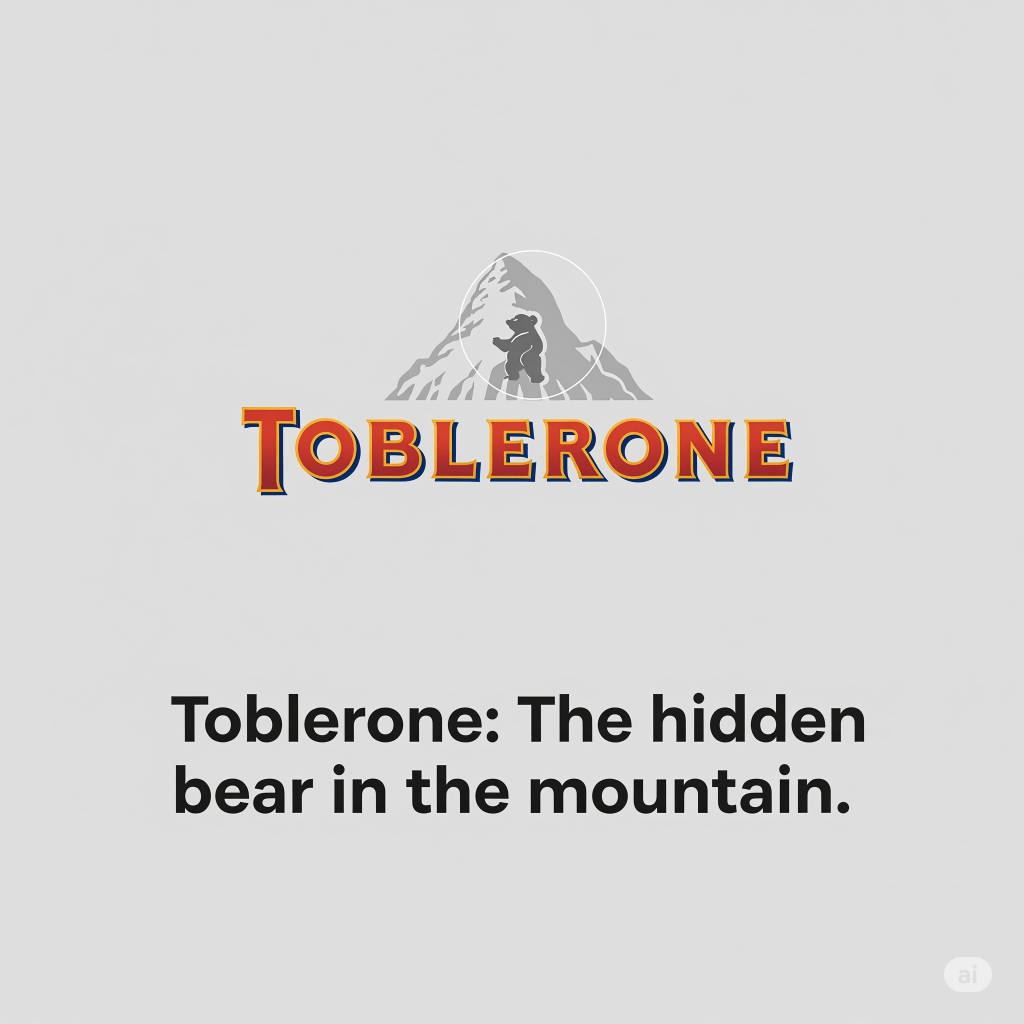
- 🏔️ Toblerone → Inside the mountain logo, there’s a hidden bear 🐻, symbolizing the city of Bern, Switzerland (where Toblerone originated).
Brands love secrets. And once you see them, you can’t unsee them.
📢 Why Shapes Speak Louder Than Words
You don’t read a logo. You feel it. Shapes trigger your gut before your brain even catches up. That’s why Nike’s swoosh makes you feel fast, even when you’re just walking to Starbucks in those sneakers.
This is the silent language of branding. And it works on you every day.
💡 Takeaway for Businesses (and Curious Humans)
If you’re starting a brand, don’t pick a shape just because it “looks nice.” Pick it because it makes people feel what you want them to feel.
- ✅ Want trust? Go square.
- ✅ Want community? Go circle.
- ✅ Want ambition? Go triangle.
- ✅ Want modern energy? Go lines.
- ✅ Want uniqueness? Go abstract.
Because logos aren’t decoration. They’re persuasion.
🔮 Conclusion: Your Brain’s Already Been Branded
Next time you shop, notice the logos tugging at your attention. The curves, the points, the secret messages. They’ve been whispering to your brain all along.
And now that you know the secret language of logos… good luck unseeing it. 😉

very nice 👌🏻 well done!!
LikeLike
thank you sooo muchhh!! 😊✨
LikeLike
It was very informative and we’ll written.
LikeLike
I am glad you liked it! 😊
LikeLike
very insightful!
LikeLike
thank you so much!
LikeLike
Nicee
LikeLike
insightful 😌
LikeLike
Thank you soo much! 😊✨
LikeLike
Insightful! Keep it up.
LikeLike
Thank you Ankita! ✨
LikeLike
waiting for more😍
LikeLike
Hahaha! Coming up with more soon! ✨😍
LikeLike
it’s amazing 👌🏻😍
LikeLike
thank you so much! 😍
LikeLike
Your blogs are amazing ❤️
LikeLike
thank you so much! means alot! 😍✨
LikeLike
Wow! Never thought of this before 🤔 very interesting 💯
LikeLike
Hahaha! Glad I could help you think in a new way! 😊
LikeLike
I love this!! There are many hidden gems in logos that I haven’t even noticed.
LikeLike
Wow!!! I absolutely loved this ❤️
LikeLike
thank you soo much
LikeLike