Ever wondered why almost every “SALE” sign is red?
Why do banks love blue?
Why does luxury somehow look better in black?
And why does McDonald’s look weird if you imagine the arches in navy blue?
It’s not random.
Before you read a single word, a colour has already said something to you.
That’s the interesting thing about colour psychology in branding.
Colours don’t just make a brand look good. They make a brand feel a certain way.
And honestly, sometimes that feeling is doing more work than the logo itself.
So let’s decode them.
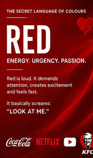
❤️ RED = Energy, urgency, passion
Red is loud.
It demands attention, creates excitement and feels fast.
Think sales, food, sports, entertainment, anything that wants you to ACT NOW.
That’s why red is everywhere during discounts.
It basically screams:
“LOOK AT ME.”
Coca-Cola, Netflix, YouTube, KFC.
Red doesn’t exactly whisper.
It walks into the room first.
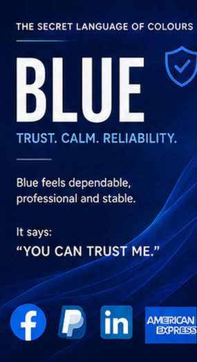
💙 BLUE = Trust, calm, reliability
Blue is probably the safest corporate colour for a reason.
It feels dependable, professional and stable.
Banks, tech companies, healthcare brands and corporate businesses love it because nobody looks at blue and immediately thinks:
“Hmm. This company is probably going to scam me.”
Facebook, PayPal, LinkedIn, American Express.
Blue says:
“You can trust me.”
Which is a pretty useful thing for a brand to say.
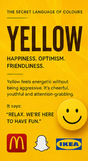
💛 YELLOW = Happiness, optimism, friendliness
Yellow feels energetic without being aggressive.
It’s cheerful, youthful and attention-grabbing.
It can make a brand feel more approachable and playful.
McDonald’s.
Snapchat.
IKEA.
Yellow basically walks in wearing sunglasses and says:
“Relax. We’re here to have fun.”
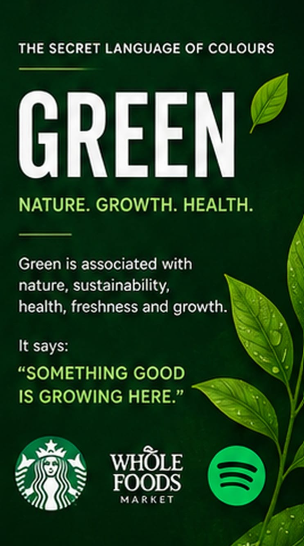
💚 GREEN = Nature, growth, health
Green has a pretty obvious association with nature.
Plants. Sustainability. Health. Freshness. Growth.
That’s why you’ll see green everywhere in organic, wellness and environmentally conscious branding.
But green can also communicate money and prosperity, which is why it works beyond just the “eco-friendly” space.
Green says:
“Something good is growing here.”
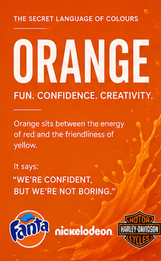
🧡 ORANGE = Fun, confidence, creativity
Orange sits somewhere between the energy of red and the friendliness of yellow.
It feels bold, playful and youthful.
It’s often used by brands that don’t want to look too serious.
Fanta.
Nickelodeon.
Harley-Davidson.
Orange says:
“We’re confident, but we’re not boring.”
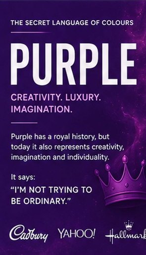
💜 PURPLE = Creativity, luxury, imagination
Purple has historically been associated with royalty, which is probably why it still carries a slightly luxurious feeling.
But today, it also represents creativity, imagination and individuality.
It works especially well when a brand wants to feel a little different.
Purple says:
“I’m not trying to be ordinary.”
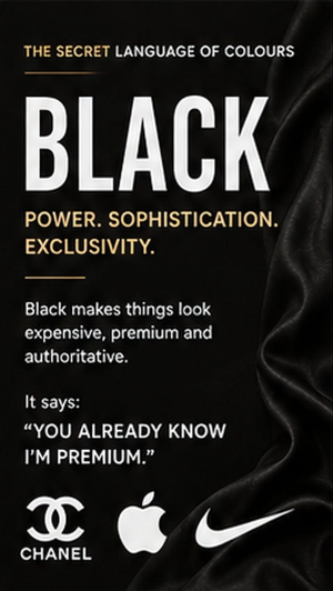
🖤 BLACK = Power, sophistication, exclusivity
Black is interesting.
It can make something look expensive without actually changing the product.
Luxury fashion.
Premium cars.
High-end technology.
Beauty brands.
Black creates a sense of sophistication, authority and exclusivity.
It doesn’t need to shout.
It just stands there looking expensive.
Black says: “You already know I’m premium.”
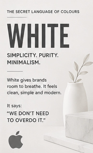
🤍 WHITE = Simplicity, purity, minimalism
White gives brands room to breathe.
It feels clean, simple and modern.
Apple is probably the easiest example.
White can make a product feel more premium because there’s less visual noise competing for your attention.
It says:
“We don’t need to overdo it.”
And honestly, that can be a very powerful branding strategy.
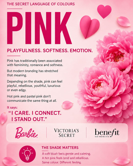
💗 PINK = Playfulness, softness, emotion
Pink has traditionally been associated with femininity, romance and softness.
But modern branding has stretched that meaning.
Depending on the shade, pink can feel playful, rebellious, youthful, luxurious or even edgy.
Hot pink and pastel pink don’t communicate the same thing at all.
And that’s the important part.
The colour alone isn’t the whole story.
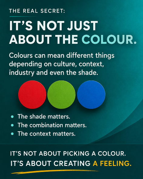
The shade matters.
The combination matters.
And most importantly, the context matters.
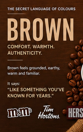
🤎 BROWN = Comfort, warmth, authenticity
Brown feels grounded.
Earthy. Warm. Familiar.
It works particularly well for coffee, food, lifestyle and heritage brands because it can create a feeling of authenticity and comfort.
Brown doesn’t try to impress you.
It feels familiar.
Like something you’ve known for years.
🩵 THE REAL SECRET: IT’S NOT JUST ABOUT THE COLOUR
Here’s where colour psychology gets interesting.
There is no universal rule saying:
Red = passion.
Blue = trust.
Green = nature.
Because colours can mean completely different things depending on culture, context, industry and even the shade being used.
A bright red and a deep burgundy don’t feel the same.
A neon green and an olive green don’t feel the same.
And a luxury brand using pink can communicate something completely different from a children’s brand using pink.
Branding isn’t about picking a colour from a chart.
It’s about asking:
“What do I want people to feel when they see me?”
Because before someone reads your tagline…
Before they understand your product…
Before they know what your brand stands for…
they’ve already felt something.
And sometimes, that feeling starts with a colour. 🎨